Tech mistake |I only wanted one thing out of 2018’s iPhone event: a new iPhone SE. In failing to provide it Apple seems to have quietly put the model out to pasture — and for this I curse them eternally. Because it was the best phone the company ever made.
If you were one of the many who passed over the SE back in 2015, when it made its debut, that’s understandable. The iPhone 6S was the latest and greatest, and of course fixed a few of the problems Apple had kindly introduced with the entirely new design of the 6. But for me the SE was a perfect match.
See, I’ve always loved the iPhone design that began with the 4. That storied phone is perhaps best remembered for being left in a bar ahead of release and leaked by Gizmodo — which is too bad, because for once the product was worthy of the lavish unveiling Apple now bestows on every device it puts out.
The 4 established an entirely new industrial design aesthetic that was at once instantly recognizable and highly practical. Gone were the smooth, rounded edges and back of the stainless original iPhone (probably the second-best phone Apple made) and the jellybean-esque 3G and 3GS.
 In the place of those soft curves were hard lines and uncompromising geometry: a belt of metal running around the edge, set off from the glass sides by the slightest of steps. It highlighted and set off the black glass of the screen and bezel, producing a specular outline from any angle.
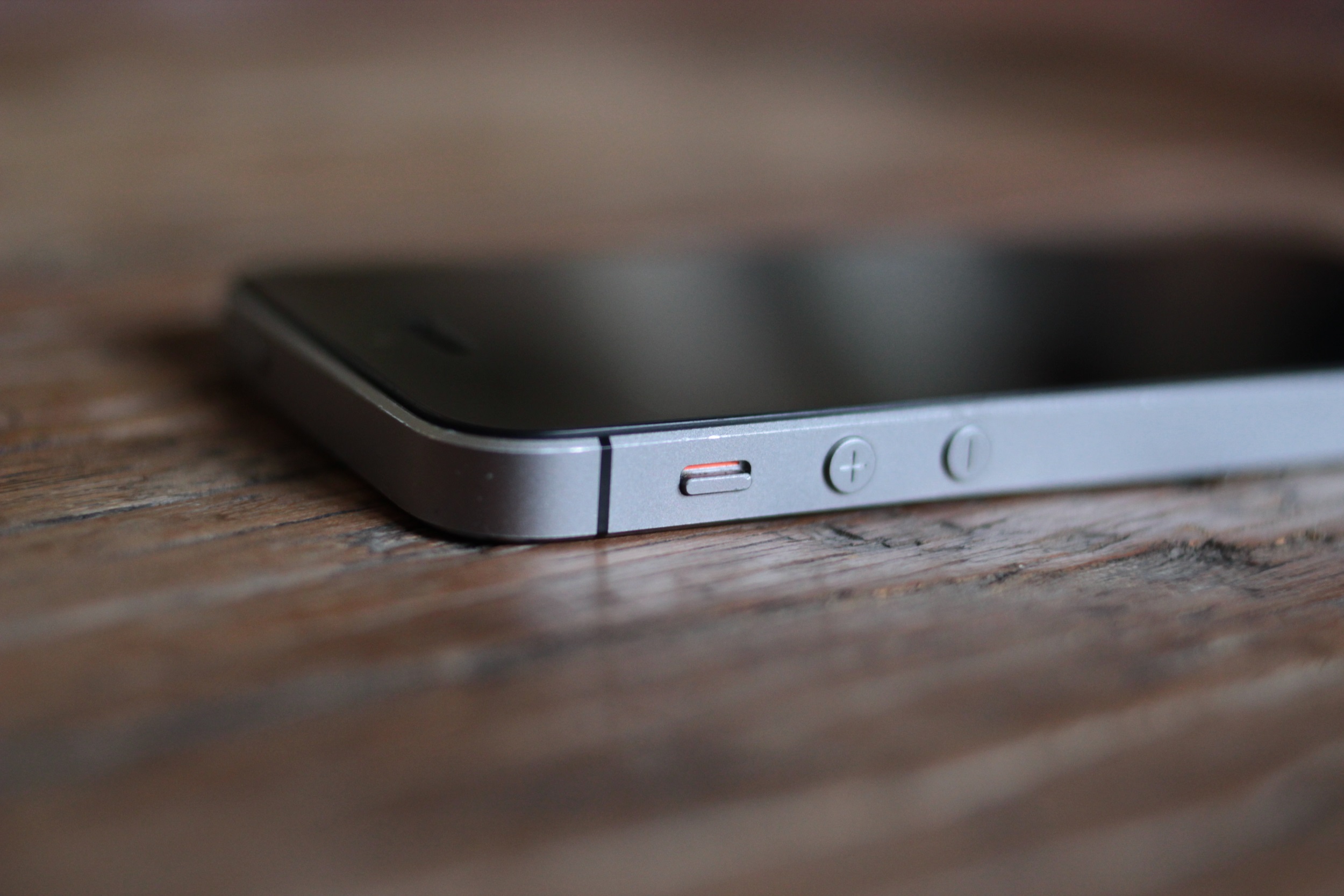
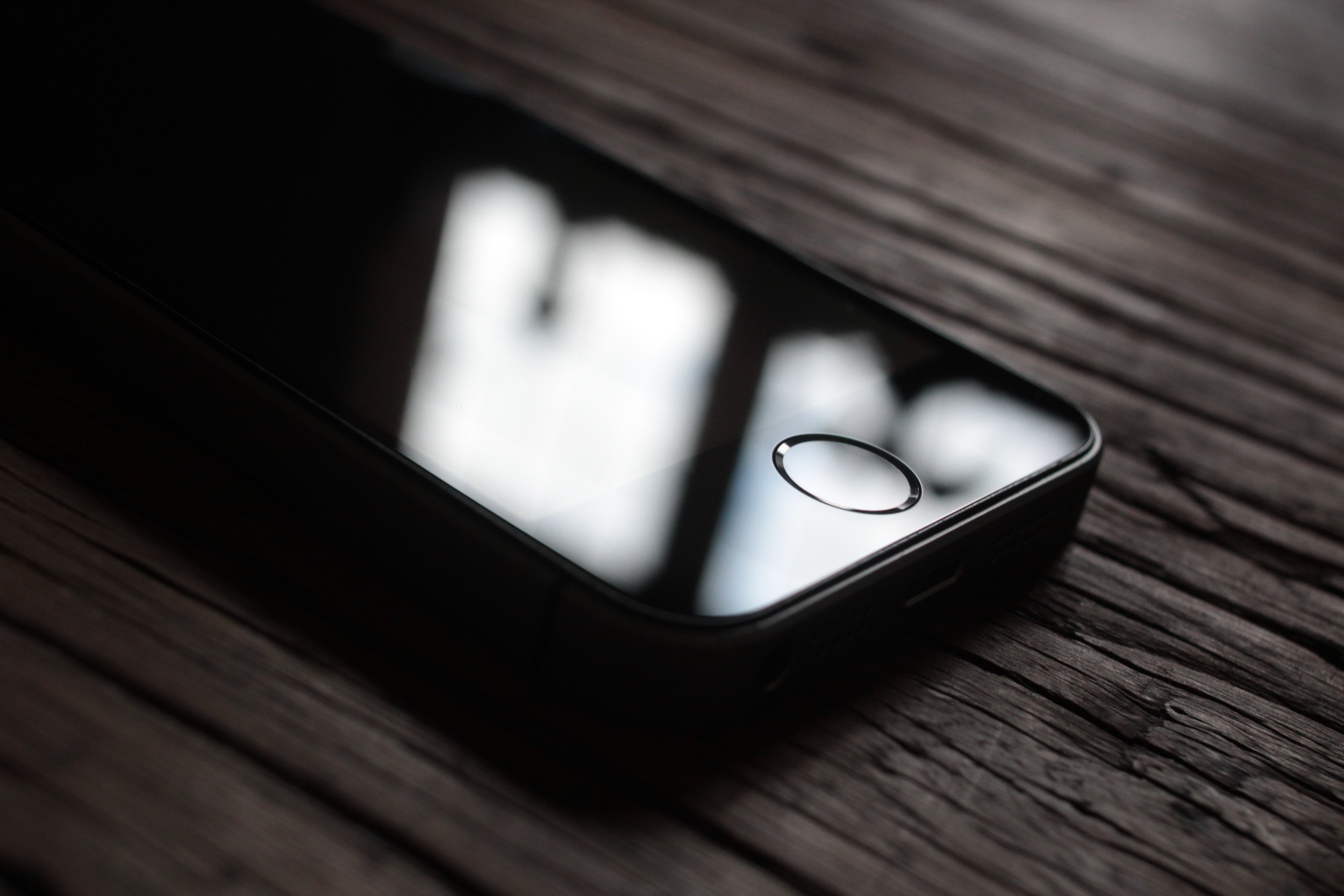
The camera was flush and the home button (RIP) sub-flush, entirely contained within the body, making the device perfectly flat both front and back. Meanwhile the side buttons boldly stood out. Volume in bold, etched circles; the mute switch easy to find but impossible to accidentally activate; the power button perfectly placed for a reaching index finger. Note that all these features are directly pointed at usability: making things easier, better and more accessible while also being attractive and cohesive as parts of a single object.
Compared to the iPhone 4, every single other phone, including Samsung’s new “iPhone killer” Galaxy S, was a cheap-looking mess of plastic, incoherently designed or at best workmanlike. And don’t think I’m speaking as an Apple fanboy; I was not an iPhone user at the time. In fact, I was probably still using my beloved G1 — talk about beauty and the beast!
The design was strong enough that it survived the initially awkward transition to a longer screen in the 5, and with that generation it also gained the improved rear side that alleviated the phone’s unfortunate tendency towards… well, shattering.
 The two-tone grey iPhone 5S, however, essentially left no room for improvement. And after 4 years, it was admittedly perhaps time to freshen things up a bit. Unfortunately, what Apple ended up doing was subtracting all personality from the device while adding nothing but screen space.
The 6 was, to me, simply ugly. It was reminiscent of the plethora of boring Android phones at the time — merely higher quality than them, not different. The 6S was similarly ugly, and the 7 through 8 somehow further banished any design that set themselves apart, while reversing course on some practical measures in allowing an increasingly large camera bump and losing the headphone jack. The X, at least, looked a bit different.
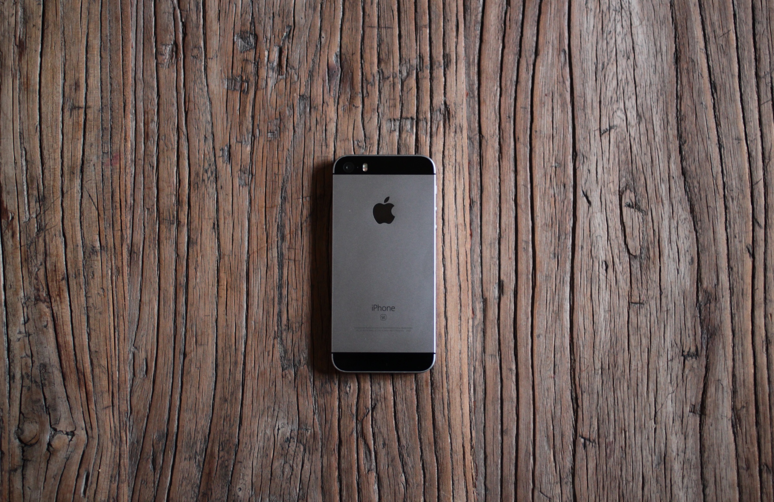
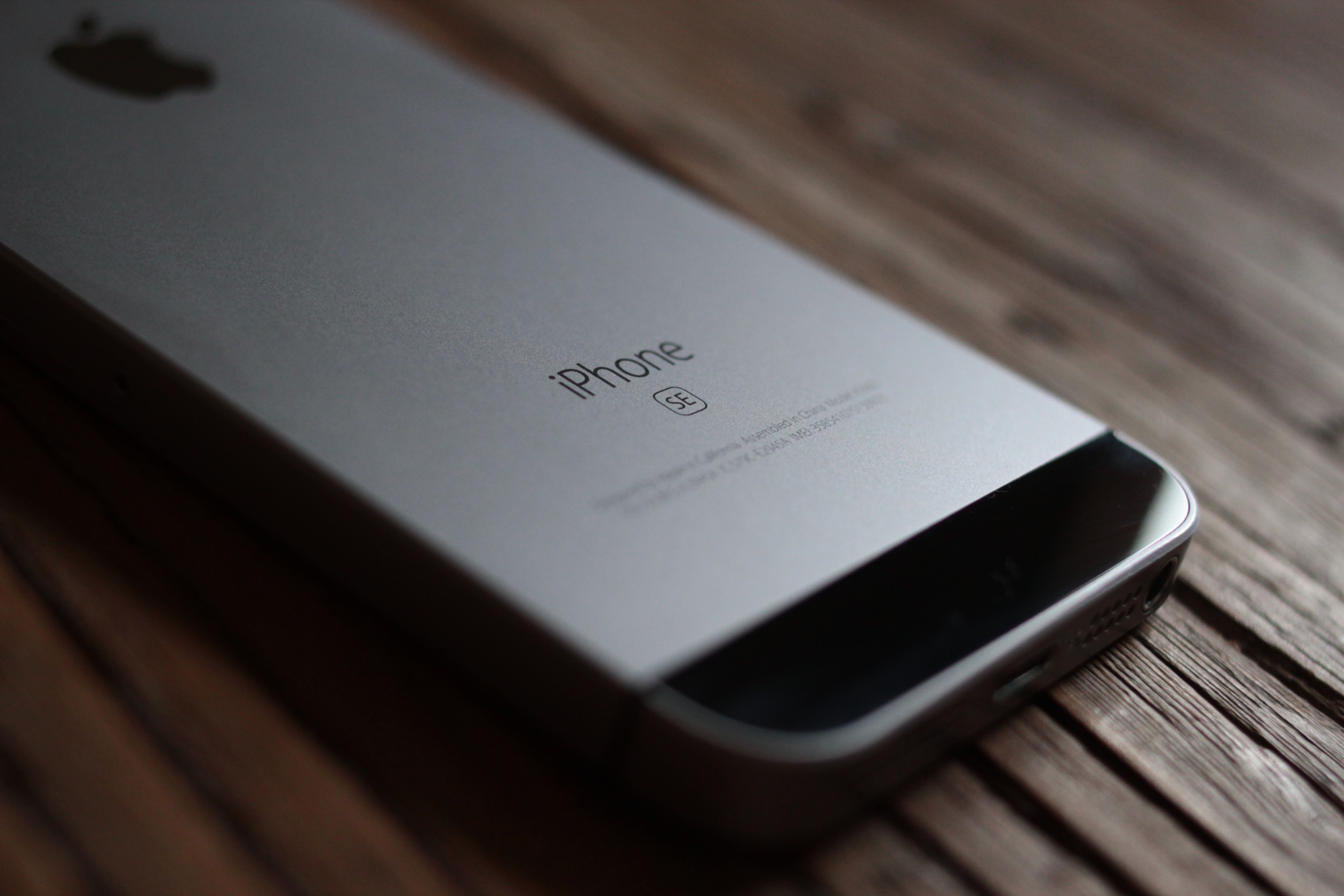
 But to return to the topic at hand, it was after the 6S that Apple had introduced the SE. Although it nominally stood for “Special Edition,” the name was also a nod to the Macintosh SE. Ironically given the original meaning of “System Expansion,” the new SE was the opposite: essentially an iPhone 6S in the body of a 5S, complete with improved camera, Touch ID sensor, and processor. The move was likely intended as a sort of lifeboat for users who still couldn’t bring themselves to switch to the drastically redesigned, and considerably larger, new model.
It would take time, Apple seems to have reasoned, to convert these people, the types who rarely buy first generation Apple products and cherish usability over novelty. So why not coddle them a bit through this difficult transition?
The SE appealed not just to the nostalgic and neophobic, but simply people who prefer a smaller phone. I don’t have particularly large or small hands, but I preferred this highly pocketable, proven design to the new one for a number of reasons.
 Flush camera so it doesn’t get scratched up? Check. Normal, pressable home button? Check. Flat, symmetrical design? Check. Actual edges to hold onto? Check. Thousands of cases already available? Check — although I didn’t use one for a long time. The SE is best without one.
At the time, the iPhone SE was more compact and better looking than anything Apple offered, while making almost no compromises at all in terms of functionality. The only possible objection was its size, and that was (and is) a matter of taste.
It was the best object Apple ever designed, filled with the best tech it had ever developed. It was the best phone it ever made.
 And the best phone it’s made since then, too, if you ask me. Ever since the 6, it seems to me that Apple has only drifted, casting about for something to captivate its users the way the iPhone 4’s design and new graphical capabilities did, all the way back in 2010. It honed that design to a cutting edge and then, when everyone expected the company to leap forward, it tiptoed instead, perhaps afraid to spook the golden goose.
To me the SE was Apple allowing itself one last victory lap on the back of a design it would never surpass. It’s understandable that it would not want to admit, this many years on, that anyone could possibly prefer something it created nearly a decade ago to its thousand-dollar flagship — a device, I feel I must add, that not only compromises visibly in its design (I’ll never own a notched phone if I can help it) but backpedals on practical features used by millions, like Touch ID and a 3.5mm headphone jack. This is in keeping with similarly user-unfriendly choices made elsewhere in its lineup.
So while I am disappointed in Apple, I’m not surprised. After all, it’s disappointed me for years. But I still have my SE, and I intend to keep it for as long as possible. Because it’s the best thing the company ever made, and it’s still a hell of a phone.
The article was originally published here.